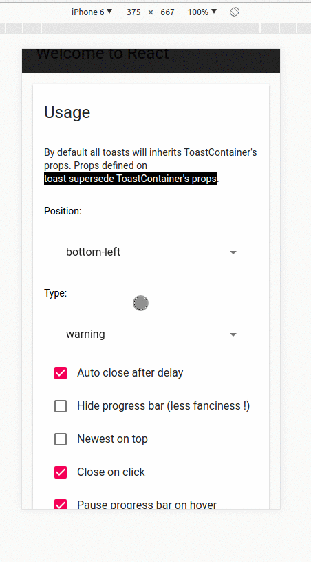
How to style

Override existing css classes

The most straightforward way to apply your own style would be to override the existing CSS classes. Below, a list of the CSS classes used(classes used for animation and media query are omitted)

/** Used to define container behavior: width, position: fixed etc... **/
.Toastify__toast-container {
}
/** Used to define the position of the ToastContainer **/
.Toastify__toast-container--top-left {
}
.Toastify__toast-container--top-center {
}
.Toastify__toast-container--top-right {
}
.Toastify__toast-container--bottom-left {
}
.Toastify__toast-container--bottom-center {
}
.Toastify__toast-container--bottom-right {
}
/** Classes for the displayed toast **/
.Toastify__toast {
}
.Toastify__toast--rtl {
}
.Toastify__toast--dark {
}
.Toastify__toast--default {
}
.Toastify__toast--info {
}
.Toastify__toast--success {
}
.Toastify__toast--warning {
}
.Toastify__toast--error {
}
.Toastify__toast-body {
}
/** Classes for the close button. Better use your own closeButton **/
.Toastify__close-button {
}
.Toastify__close-button--default {
}
.Toastify__close-button > svg {
}
.Toastify__close-button:hover, .Toastify__close-button:focus {
}
/** Classes for the progress bar **/
.Toastify__progress-bar {
}
.Toastify__progress-bar--animated {
}
.Toastify__progress-bar--controlled {
}
.Toastify__progress-bar--rtl {
}
.Toastify__progress-bar--default {
}
.Toastify__progress-bar--dark {
}

Build your own style using the scss files

Grab the scss directory of the repository and build your own stylesheet. If you just want to changes some colors most of them are defined inside the _variables.scss file.

scss
├── _closeButton.scss
├── _progressBar.scss
├── _toast.scss
├── _toastContainer.scss
├── _variables.scss
├── 📁 animations
│ ├── _bounce.scss
│ ├── _flip.scss
│ ├── _slide.scss
│ └── _zoom.scss
├── main.scss
└── minimal.scss
Info

You built an amazing theme and you want to share it with the community, please let me know. Contributions are welcome!

Passing css classes to component

The ToastContainer accept the following props for styling:

  • className: applied to the container
  • toastClassName: applied on the toast wrapper
  • bodyClassName: applied on the toast body
  • progressClassName: applied on the progress bar
  • style: inline style applied to the container
<ToastContainer className="foo" style={{ width: "2000px" }} />

When displaying a notification you can also set some css classes:

  • className: applied on the toast wrapper (this override toastClassName is set by the container )
  • bodyClassName: applied on the toast body (this override bodyClassName is set by the container )
  • progressClassName: applied on the progress bar (this override progressClassName is set by the container )
  • style: inline style applied to the toast
toast("Custom style",{
className: 'black-background',
bodyClassName: "grow-font-size",
progressClassName: 'fancy-progress-bar'
});

Css classes as function

You can also provide a function. This is what it looks like with tailwind css

const contextClass = {
success: "bg-blue-600",
error: "bg-red-600",
info: "bg-gray-600",
warning: "bg-orange-400",
default: "bg-indigo-600",
dark: "bg-white-600 font-gray-300",
};
const App = ()=> {
return (
<Main />
<ToastContainer
toastClassName={({ type }) => contextClass[type || "default"] +
" flex p-1 min-h-10 rounded-md justify-between overflow-hidden cursor-pointer"
}
bodyClassName={() => "text-sm font-white font-med block p-3"}
position="bottom-left"
autoClose={3000}
/>
)
}

How to style with styled-components

Extend existing css classes

You can override the css classes with styled-components. You can find the list of the css classes used here. This is where you will also define the style for your notification.

import React from 'react';
import styled from 'styled-components';
import { ToastContainer } from 'material-react-toastify';
const StyledContainer = styled(WrappedToastContainer).attrs({
// custom props
})`
.Toastify__toast-container {}
.Toastify__toast {}
.Toastify__toast--error {}
.Toastify__toast--warning {}
.Toastify__toast--success {}
.Toastify__toast-body {}
.Toastify__progress-bar {}
`;

Pass css classes to props

const StyledToastContainer = styled(ToastContainer).attrs({
className: 'toast-container',
toastClassName: 'toast',
bodyClassName: 'body',
progressClassName: 'progress',
})`
/* .toast-container */
width: 100%;
/* .toast is passed to toastClassName */
.toast {
background-color: var(--color-black);
}
button[aria-label="close"] {
display: none;
}
/* .body is passed to bodyClassName */
.body {}
/* .progress is passed to progressClassName */
.progress {}
`;

Styling from scratch

If you want to style from scratch simply include the bare minimum style and you are good to go.

import 'material-react-toastify/dist/ReactToastify.minimal.css';

Mobile

On mobile, the toast will take all the available width.

react toastiy mobile